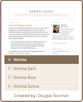
There are thousands of blog templates that we can choose from and apply to our blog. However some of us prefer to arrange our own layout or design according to our need and taste, even though we only have a little knowledge about the html and css code. It is better to learn how to do it our self rather than just use what ever they gave us.
It is not so hard to customize or to change our 2 coloums blog template to 3 coloums if we know the concept and have a bit of knowledge related to html and css coding.
For example, to change a simple 2 coloums minima blog template created by Douglas Bowman to 3 coloums, there are a couple of steps that we have to take.
Step 1:
Determine and decide on our total blog width, (main coloum + 1st side bar coloum + 2nd side bar coloum width).
For example change the total width from 660px to 1020px (i.e., main-wrapper 470px + sidebar-wrapper 300px + newsidebar-wrapper 250px = outer-wrapper 1020px). I change the dimension as above because most of the ads and widgets available usually use those dimensions. Make amendment by editing the template html code.
Before editing the template, you may want to save a copy of it if anything went wrong.

Log in to your blog layout page and edit HTML. Click on the "Download Full Template" to save the existing template to our computer hard disk. In case of anything happened, we can revert it to the original/previous template.
Find the css code of id name "outer-wrapper" between the <head> to </head> segment. [To easily find the spot, hold Ctrl key + F and type "#outer-wrapper" in the pop-up text box].
/* Outer-Wrapper
----------------------------------------------- */
#outer-wrapper {
width: 1020px;
margin:0 auto;
padding:10px;
text-align:$startSide;
font: $bodyfont;
}
#main-wrapper {
width: 470px;
float: left;
word-wrap: break-word; /* fix for long text breaking sidebar float in IE */
overflow: hidden; /* fix for long non-text content breaking IE sidebar float */
}
#sidebar-wrapper {
width: 300px;
float: left;
word-wrap: break-word; /* fix for long text breaking sidebar float in IE */
overflow: hidden; /* fix for long non-text content breaking IE sidebar float */
}
#newsidebar-wrapper {
width: 250px;
float: left;
word-wrap: break-word; /* fix for long text breaking sidebar float in IE */
overflow: hidden; /* fix for long non-text content breaking IE sidebar float */
}

Find the html code of id name "sidebar-wrapper" between the <body> to </body> segment. [Once again, to easily find the spot just hold Ctrl key + F and type "id='sidebar-wrapper'" in the pop-up text box]. We need to type in the html code for our newsidebar-wrapper after the code of our sidebar-wrapper as the figure above or copy and paste the code below:
<div id="newsidebar-wrapper">
<b:section class="sidebar" id="newsidebar" preferred="yes">
</b:section>
<b:section class="sidebar" id="newsidebar" preferred="yes">
</b:section>
One more thing that is quite interesting is that the "Add a Gadget" element can be turn on by changing the the "showaddelement" value from "no" to "yes" on our wrappers html code.
For example the "crosscol-wrapper" html code which was created, couldn't be seen on the page element because the "showaddelement" value was set as "no" and now has been changed to "yes" so that we can see it.
Finally, after we have finished amending the template, we may preview and save the template.
If everything is ok, our page element will look like the figure above. Can you spot the different? Yes, there are 3 new items on our page elements. The "crosscol - Add a Gadget", the "main - Add a Gadget" and our "newsidebar - Add a Gadget".
Now we may add new items immediately below the header and also above our post. To make the header and the footer to be the same size as the outer-wrapper, we need to change the width value of both of its to 1020px.
Take your time to try it and good luck.


good info.. i've tried it before.. my blog looks better with 3-column..
ReplyDeleteNice! Sometime I´ll try!
ReplyDeleteluv this post. jelas dan tuntas, sy nak try jugak....
ReplyDeletedah berjaya dah....mmg senang sgt...tq very big much....
ReplyDelete